Zoe Financial
Zoe Financial is an online platform that matches consumers with the top 5% independent financial advisors and planners across the country. Zoe empathizes with “the people" by matching advisors based on consumer needs and life circumstances.
Goal
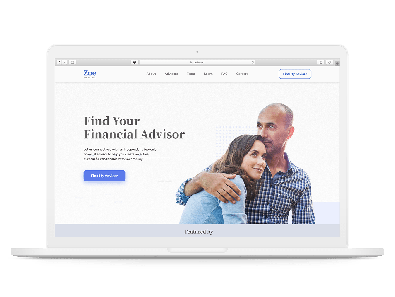
Zoe needed a refined online experience for consumers, advisors, and investors to increase engagement and prospect conversion.
- Design a web experience that improves conversion for both consumers & advisors.
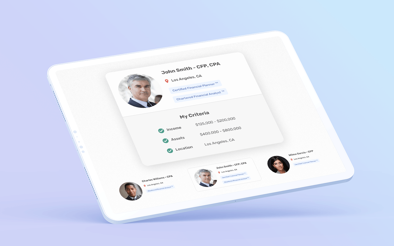
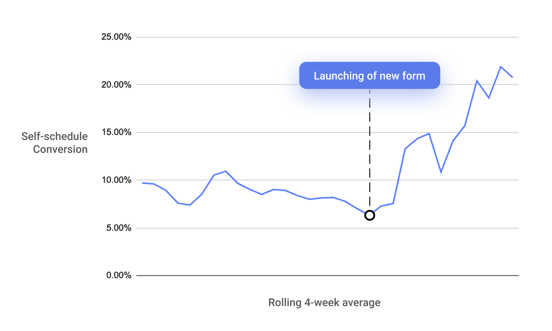
- Increase engagement of their consumer survey form for higher scheduling rates.
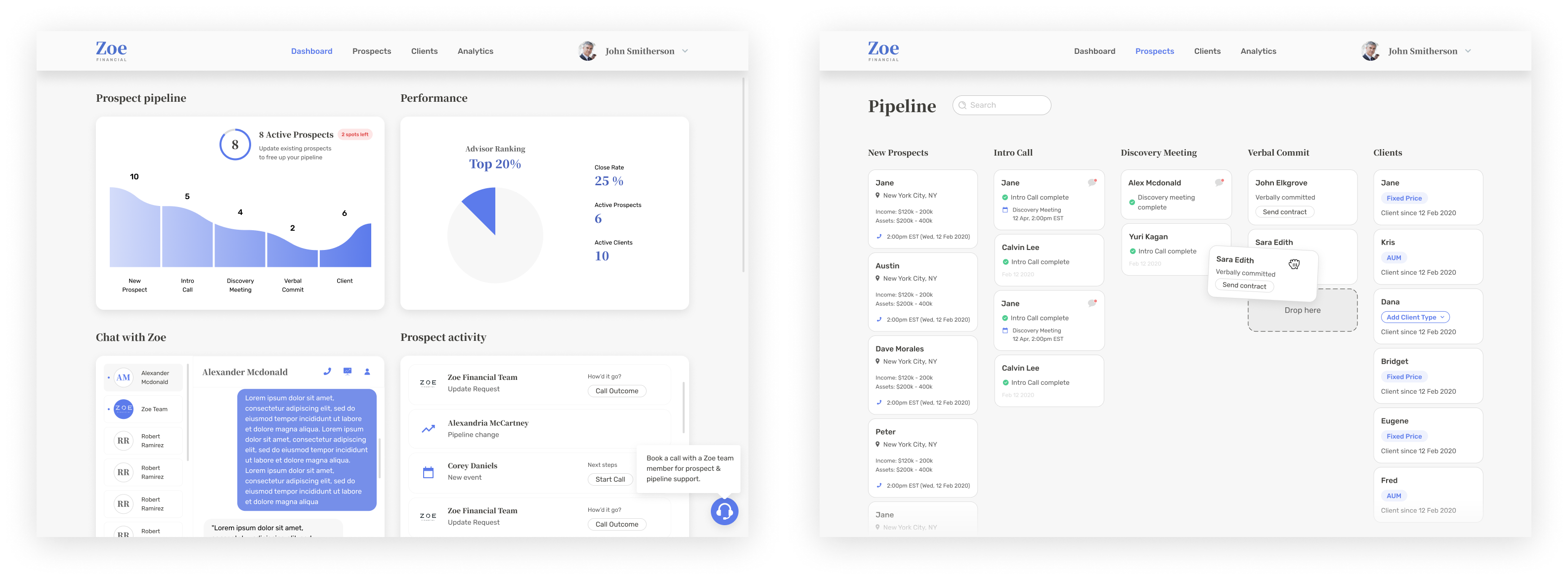
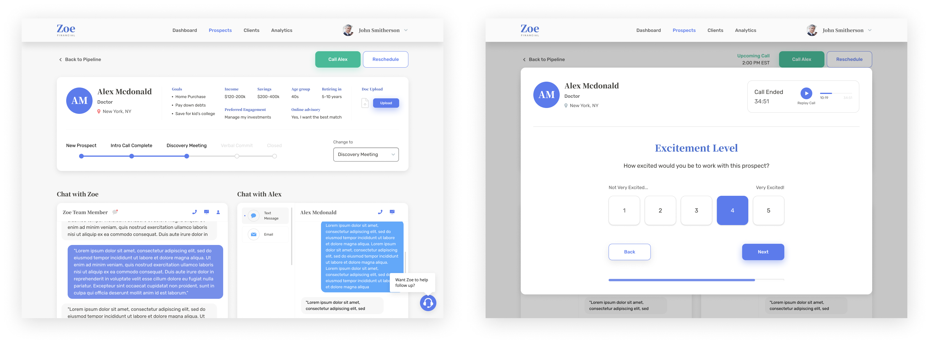
- Design an advisor portal with pipeline analytics to optimize prospect management and conversion.
Discovery
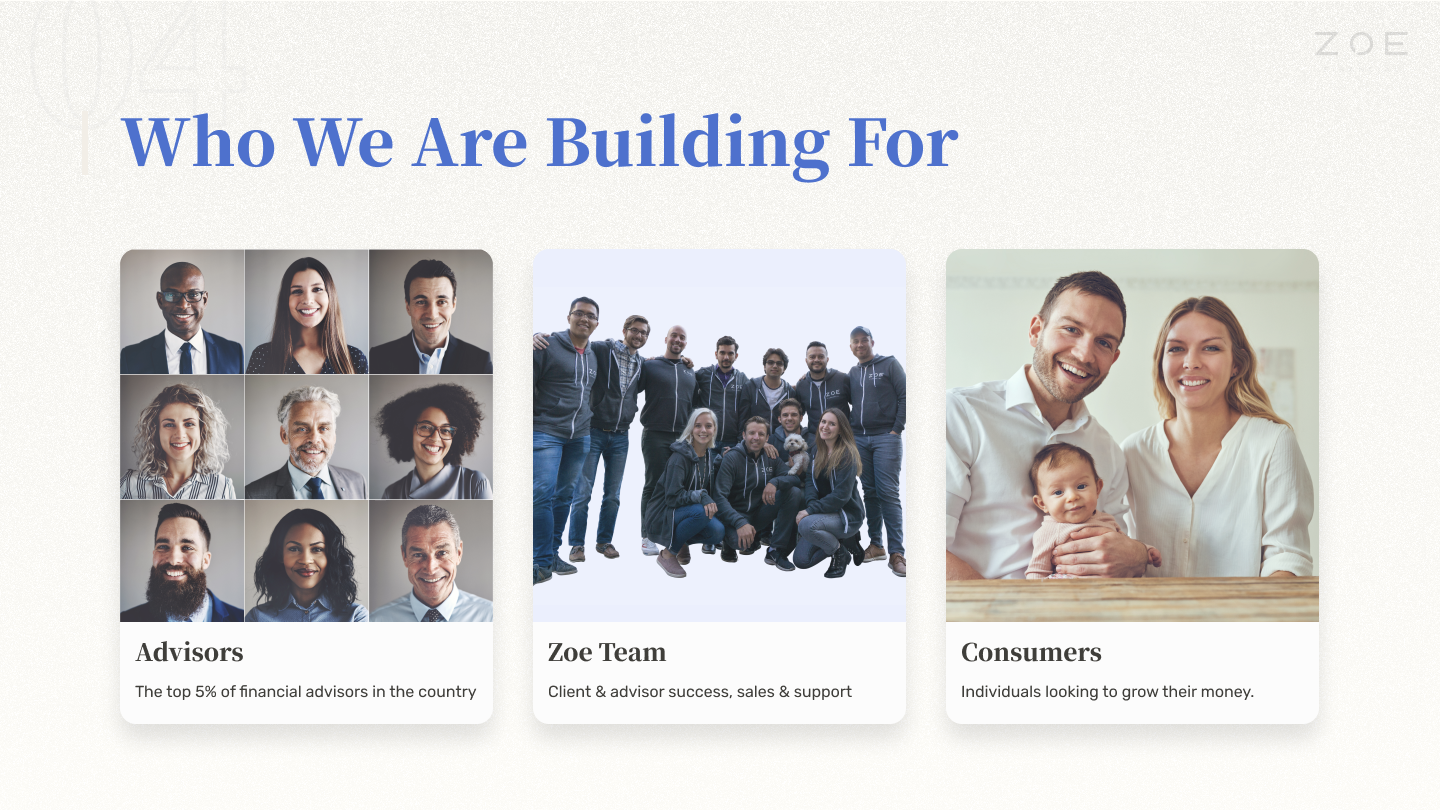
Target users
Age 40 to 60 - Typically older individuals or couples who are not experts in finance but seek financial stability.
Risk-averse - Recognize the importance of choosing the right advisor who is trustworthy and informed.
Growth - Users in the life stage to grow their wealth with confidence.
Values
Trust & credibility - Users are risk-averse; They require a high level of trust in the advisor to guide the risk-taking. A credible provider is needed to avoid the risk of a negative or fraudulent experience.
Transparency & authenticity - Users seek an advisor with good intentions and nature.
Advisor relationship - User understanding of financial advisement is limited and they need personalized education or a road map to feel confident in their decisions.
Pain points
Conversion - Zoe's overall web experience (marketing, value proposition, and onboarding) was not very engaging or inspiring.
Brand authority - Zoe's visual language did not reflect the refined qualities the target users seek (mature, authoritative, & trustworthy).
Design
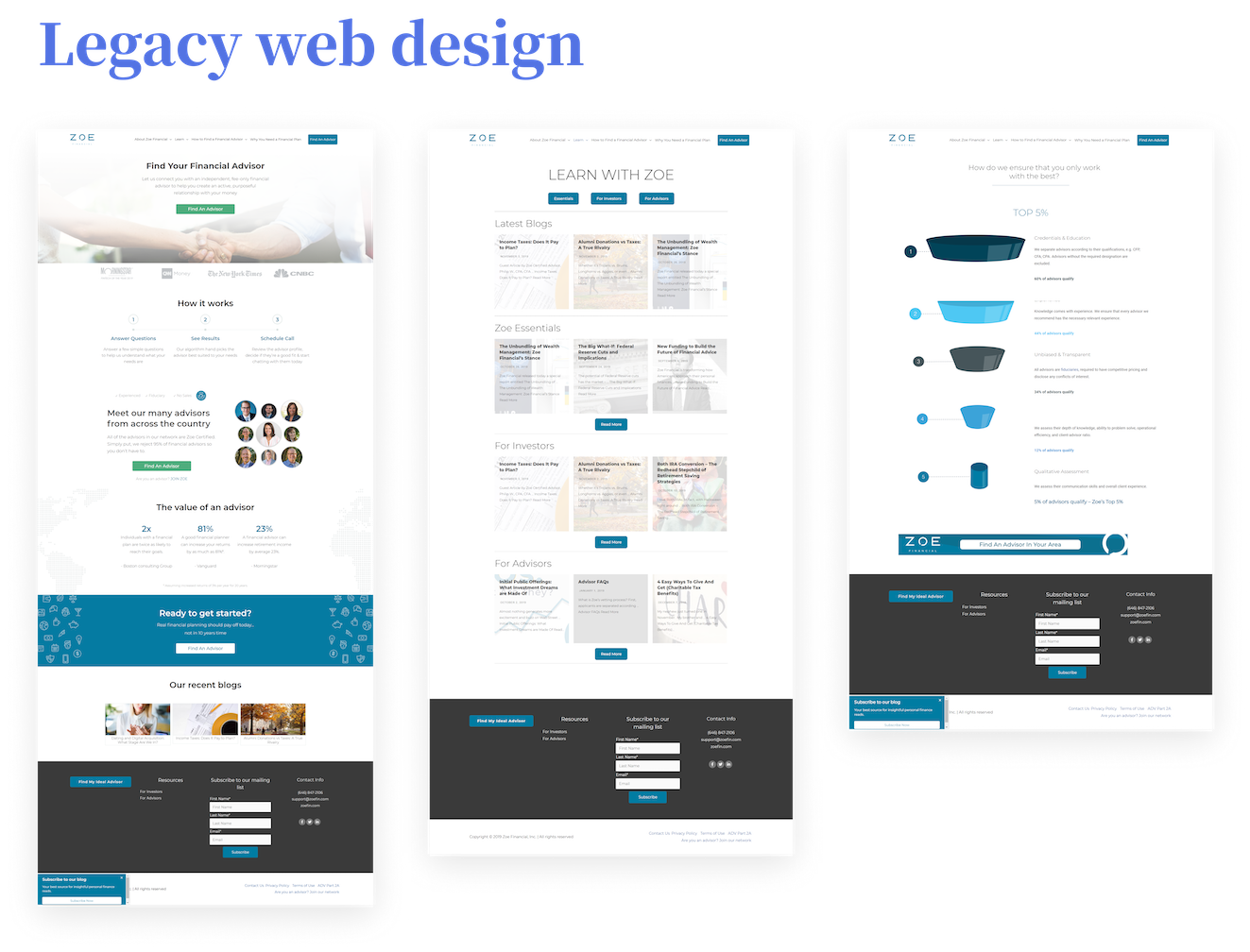
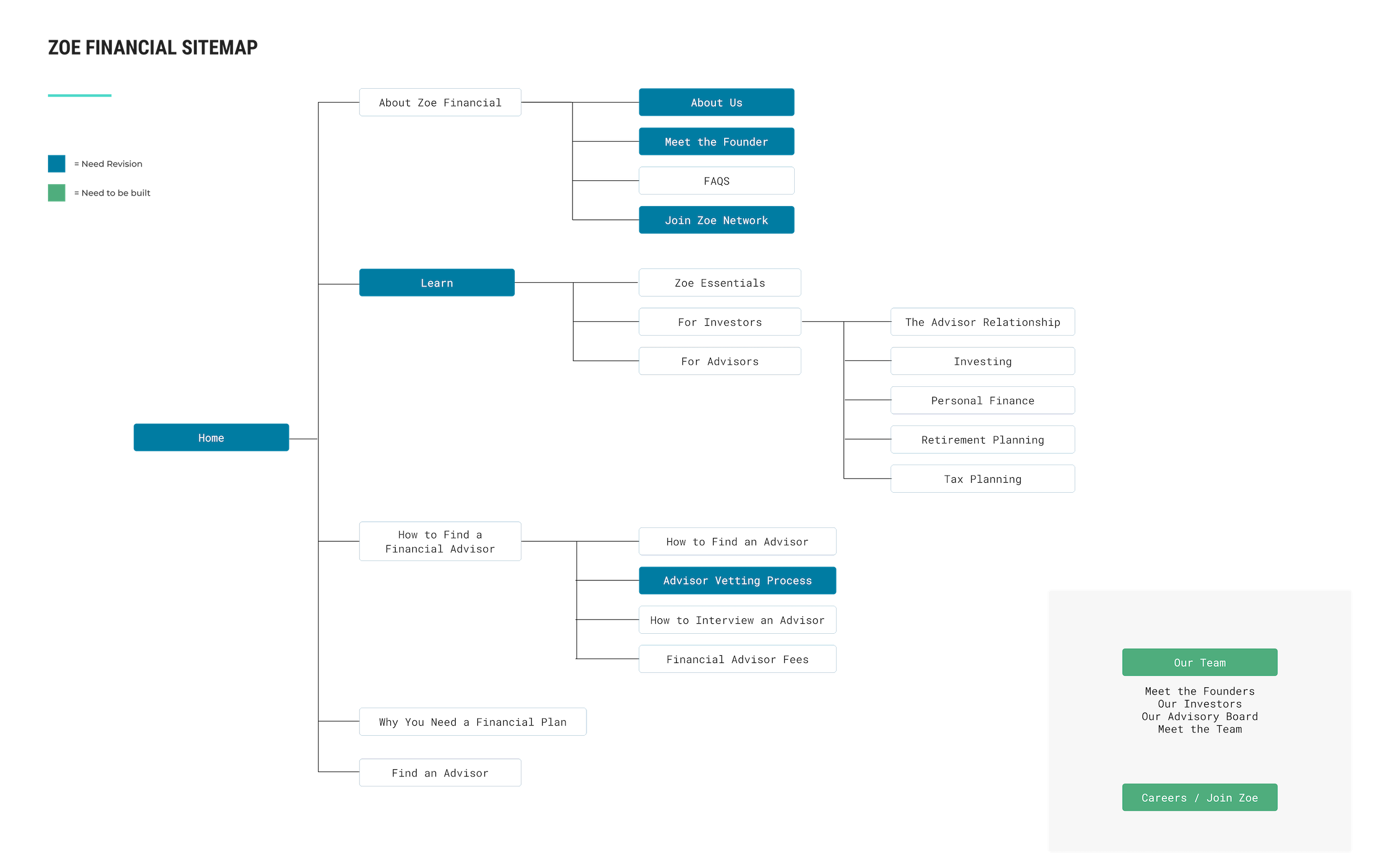
Architecture
I scoped the legacy information architecture to fully understand the boundaries of the experience. I identified the pain points and growth areas of each page to prioritized based on level of impact vs. level of effort.
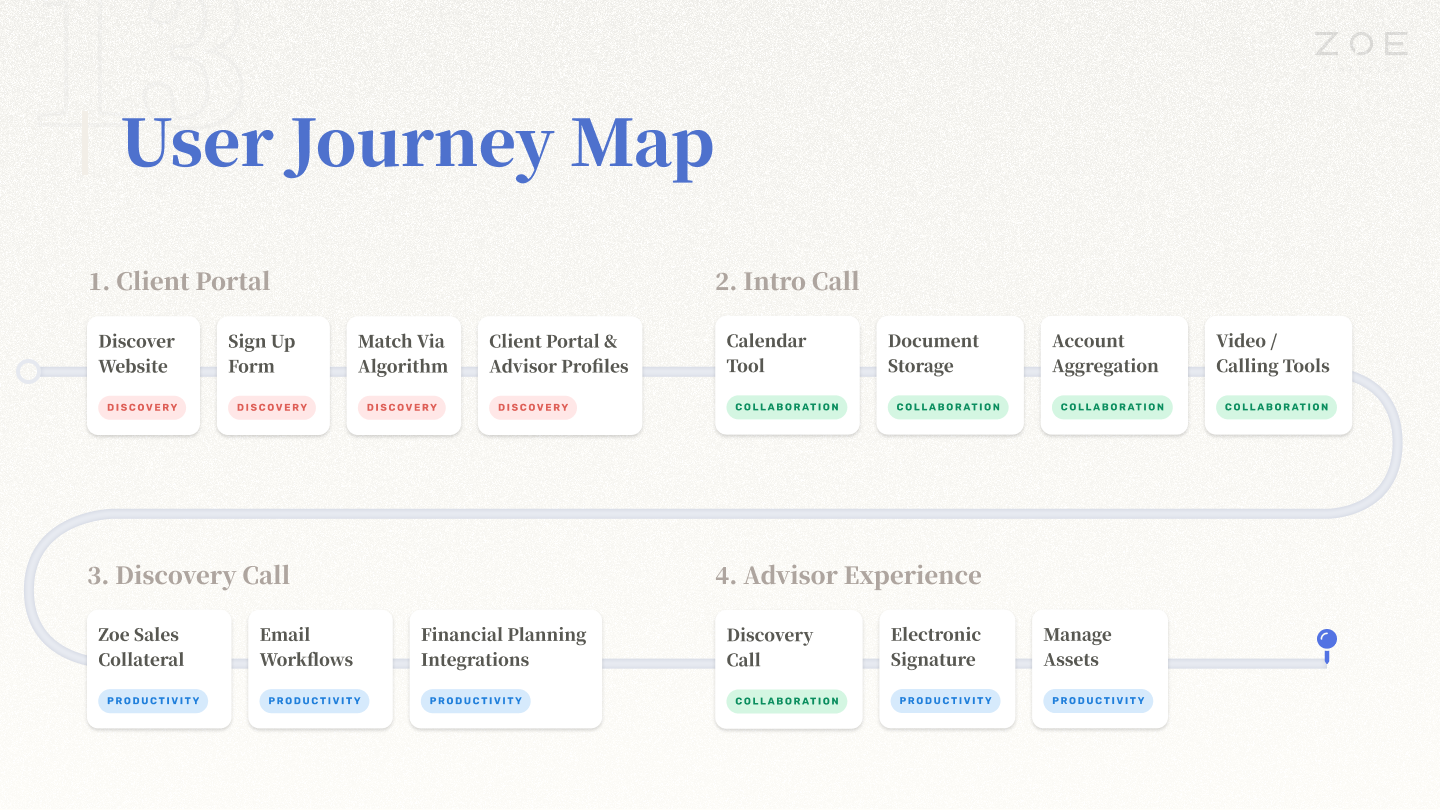
User journey
I created a user journey map to capture the end-to-end experience from a market qualified lead to advisor client. This map is the strategic backbone to drive concept to execution.
Service blueprint
I created a service blueprint to interaction landscape in detail. This drives the necessary requirements clearly and sets expectations early.
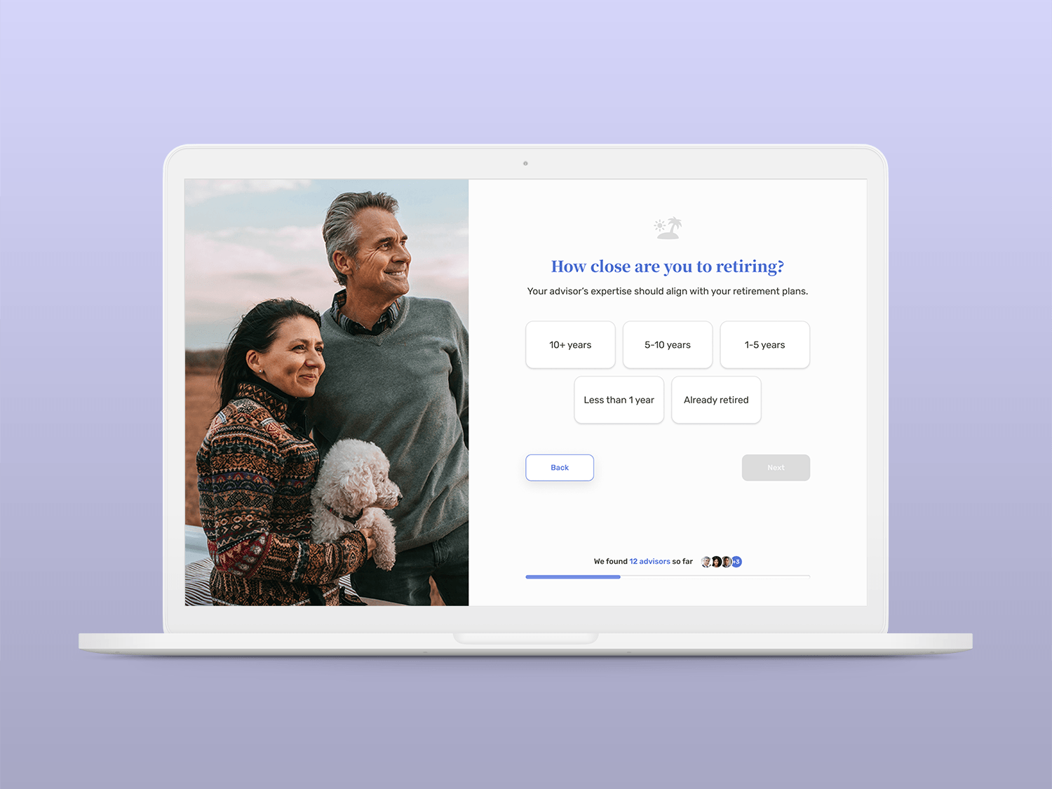
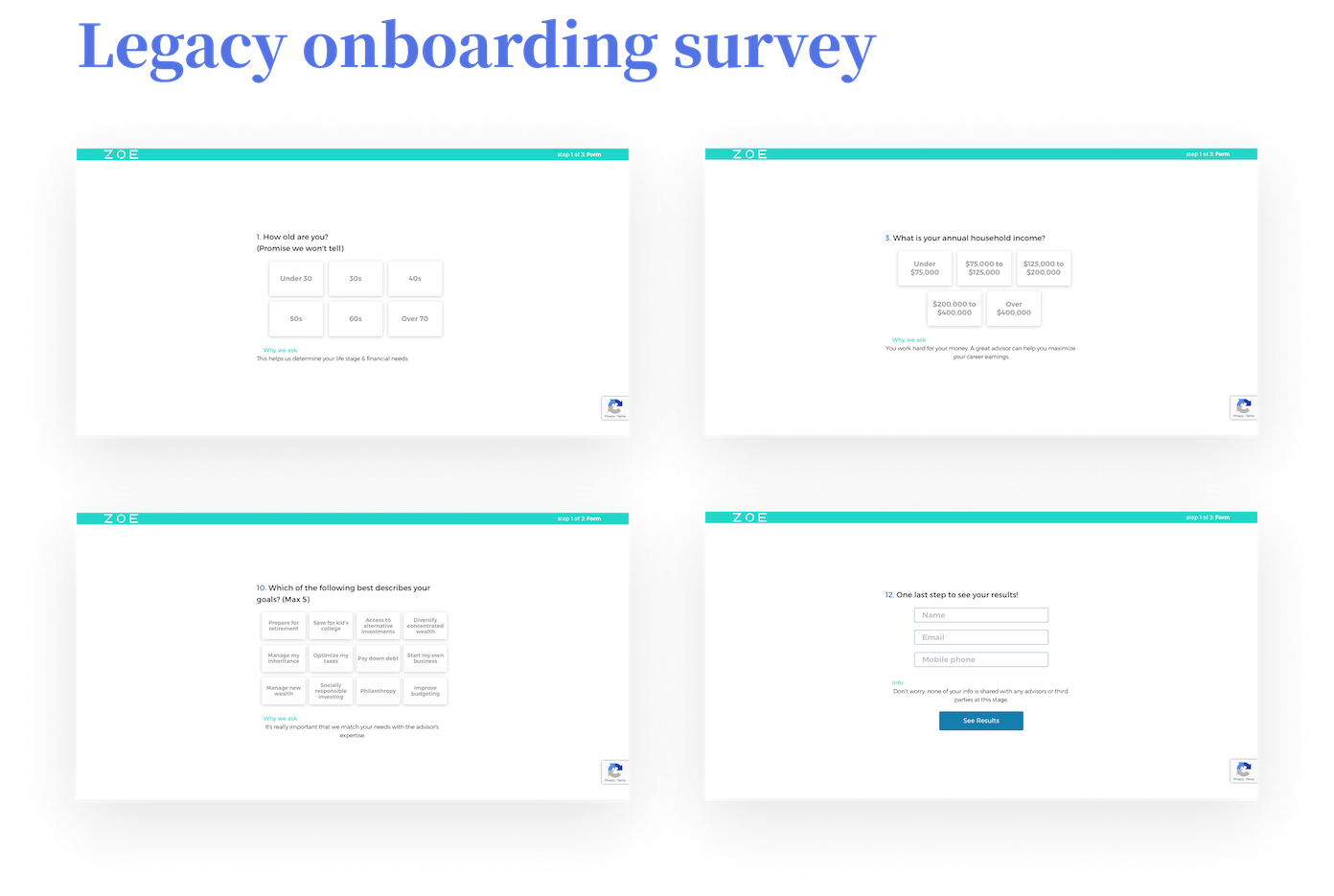
Wireframing
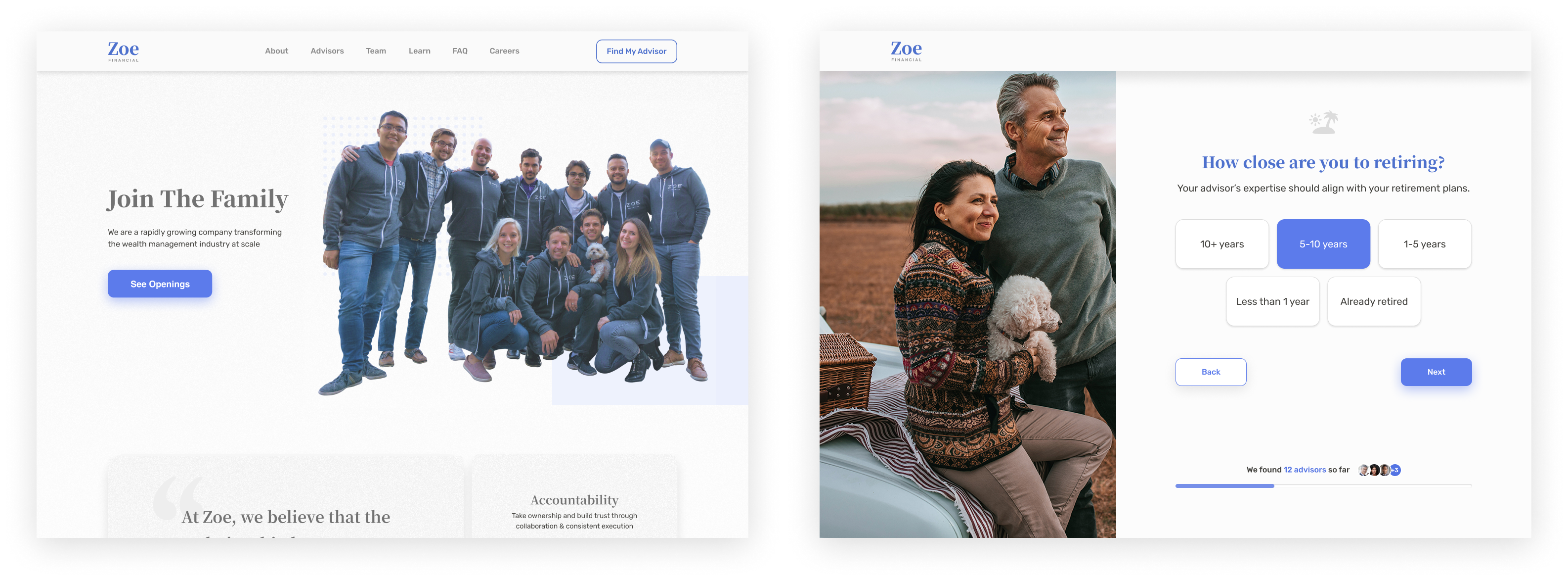
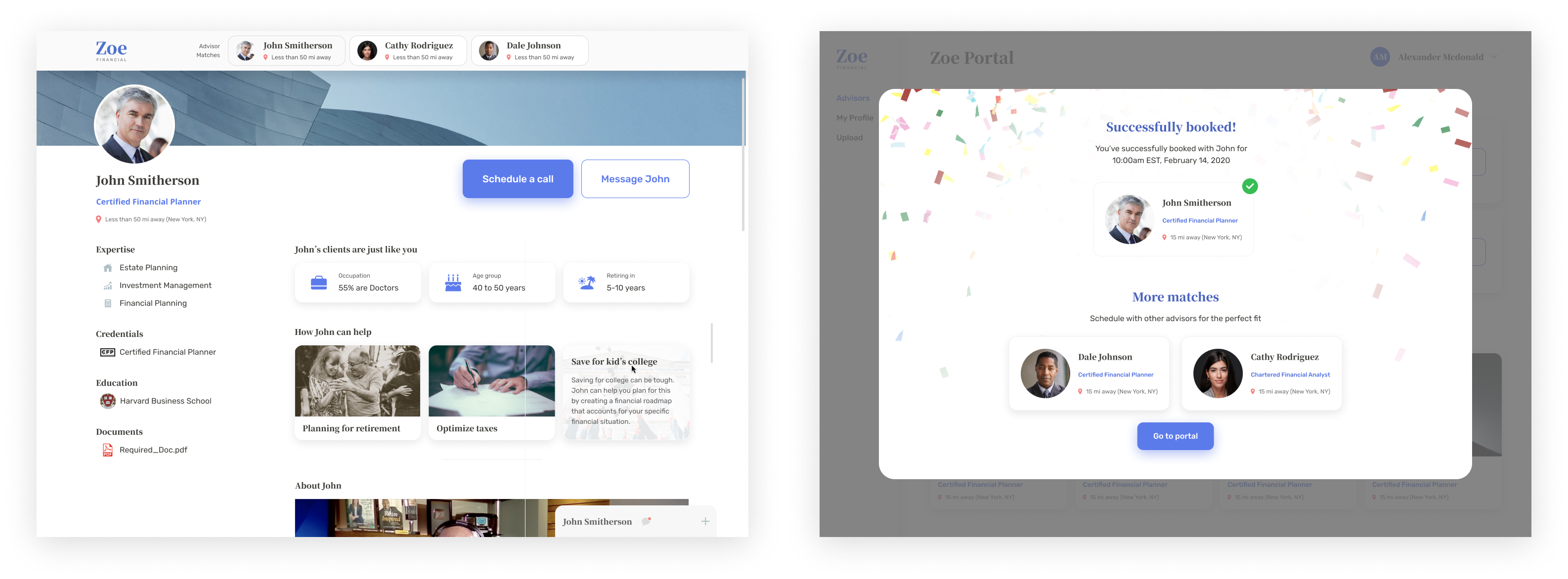
I wireframed the marketing site, onboarding survey, and advisor matching process in phases for rapid feedback and iteration.
Rapid Iteration
A full scope project will have at least 300 comments. Refinement is just the name of the game for a better end product.
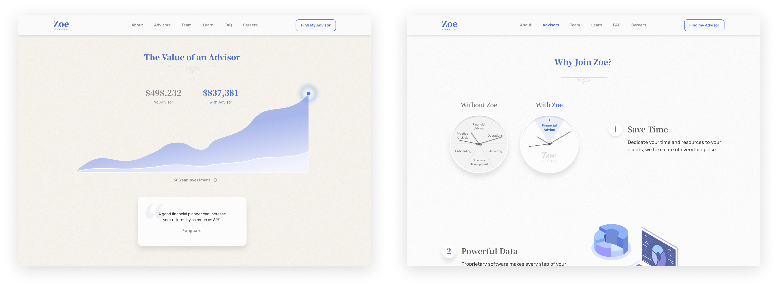
Visuals
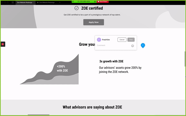
I applied a modern, balanced, yet minimal visual style to cater to a more sophisticated generation. Creating a clean and mature online presence was key to building trust and empathizing with the core audience.
Results
Successes
- 20% increase in consumer scheduling rate with advisor matches.
- Simplified architecture and complete UX/UI redesign for marketing, onboarding, and advisor dashboard for desktop and mobile.
- Communicated brand identity of trust, authority, and empathy through a clean and modernized visual style.
Lessons Learned
- The user is a deep well of personalities, life circumstances, motivations, and behaviors. Understanding this in detail ultimately shapes the final experience.
- User testing always reveals what decisions were speculative or based on truth. Human testing is the key to real and raw data.
- Brand identity can be quite amorphous but still can be broken down and translated into very logical design decisions.
Sam's ClubConsumer, Enterprise, Design Systems
TwitterEnterprise, Design Systems
TeslaEnterprise, Design Systems
Plus.aiStartup
NxStopStartup

PhotographyPersonal