NxStop
NxStop is a real-time transit tracking app that provides transit data to students, parents, and school administrators.
James Polhemus, Founder & CEO, created NxStop so students wouldn't have to miss a bus in sub-zero degree Jersey winters like he did.
Goal
Visual storytelling - Translate the transit journey into a visual story with a beginning and end for multiple users.
Action from insight - Introduce more meaningful data to provide insight and encourage action.
Modernization - Simplify, clean up, and modernize the interface for a competitive edge.
Discovery

Target users
Students - K-12 Students need to board their bus on time and make sure they’re on time for school.
Parents - Parents need assurance that their children are dropped off to school safely.
Administrators - School administrators need to manage all bus routes, provide system notifications, and affirm parents of their children's transit success.
Pain points
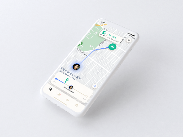
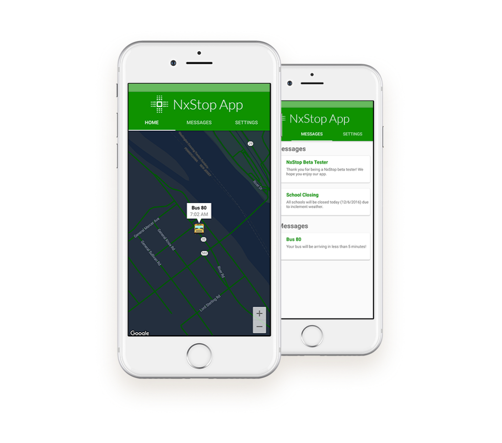
Mobile - The mobile app did not visually communicate with a start or end in mind. Route progression, boarding status, destination timeline - these were all missing.
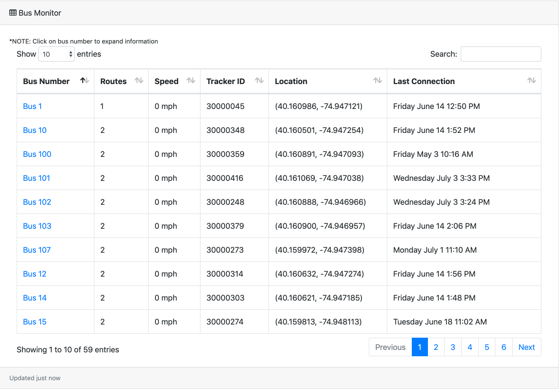
Desktop - The desktop navigation took the user through a maze of confusing options when trying to manage a route. The UI was completely unbranded.
Design
Mobile features
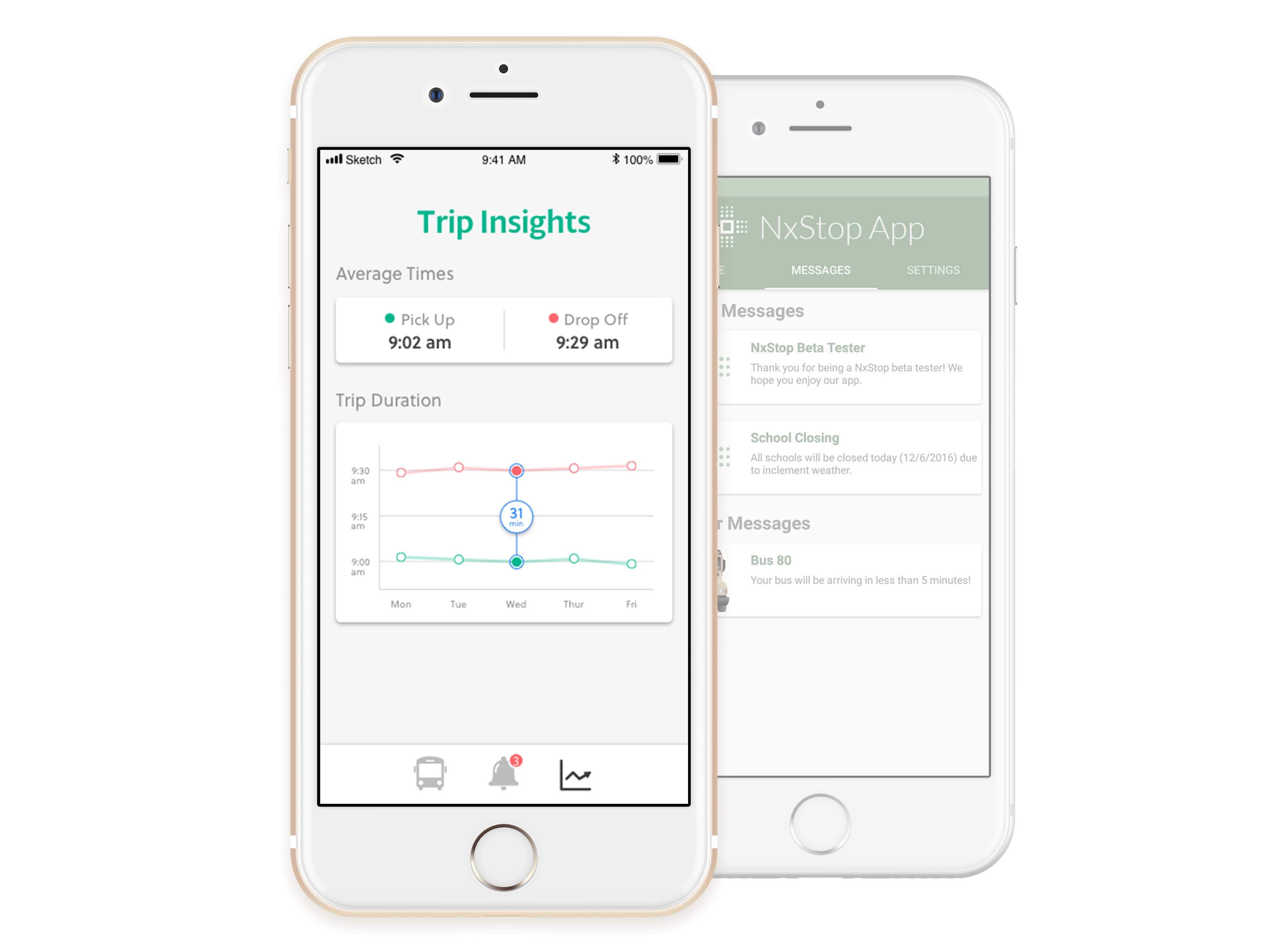
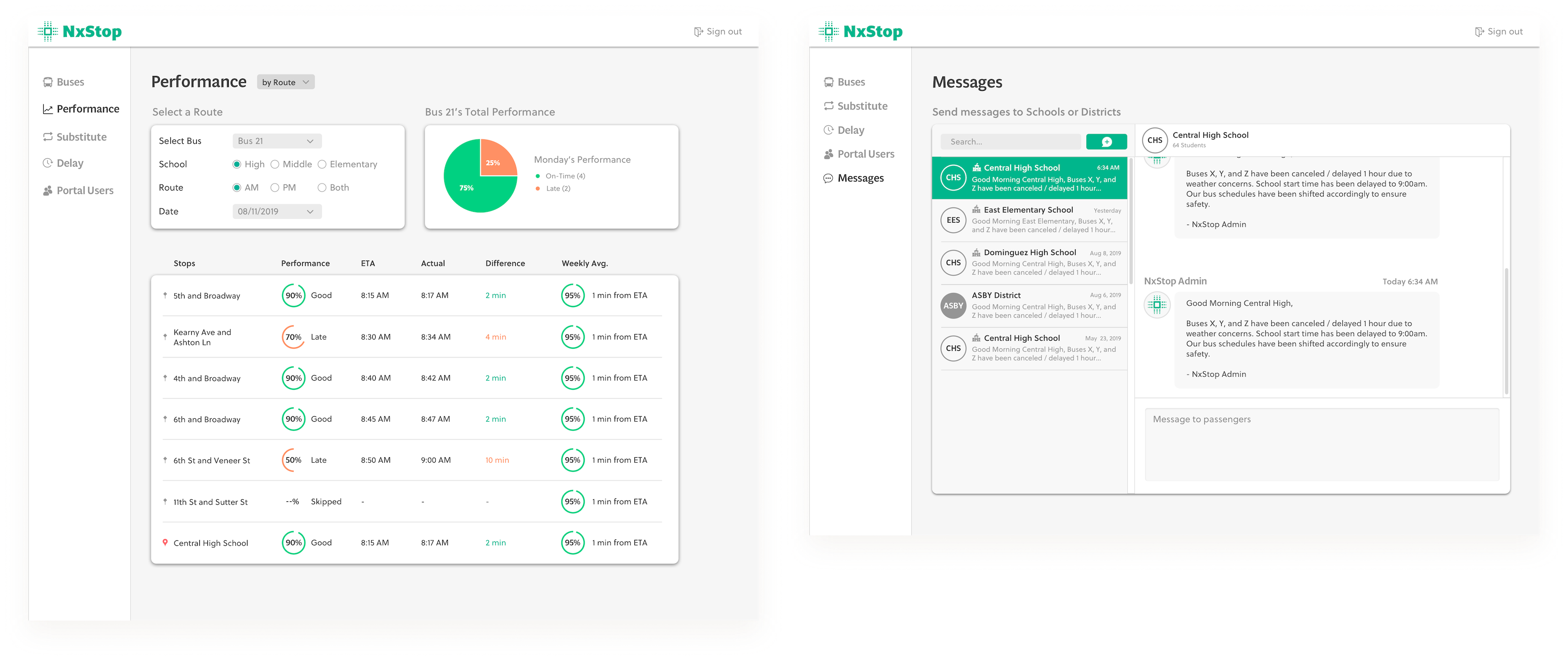
Performance insights - Students either catch the bus or miss it. The app did not display data based on previous history. I created “Trip Insights” to display real-time alerts, performance history, and schedule predictions clearly and minimally.
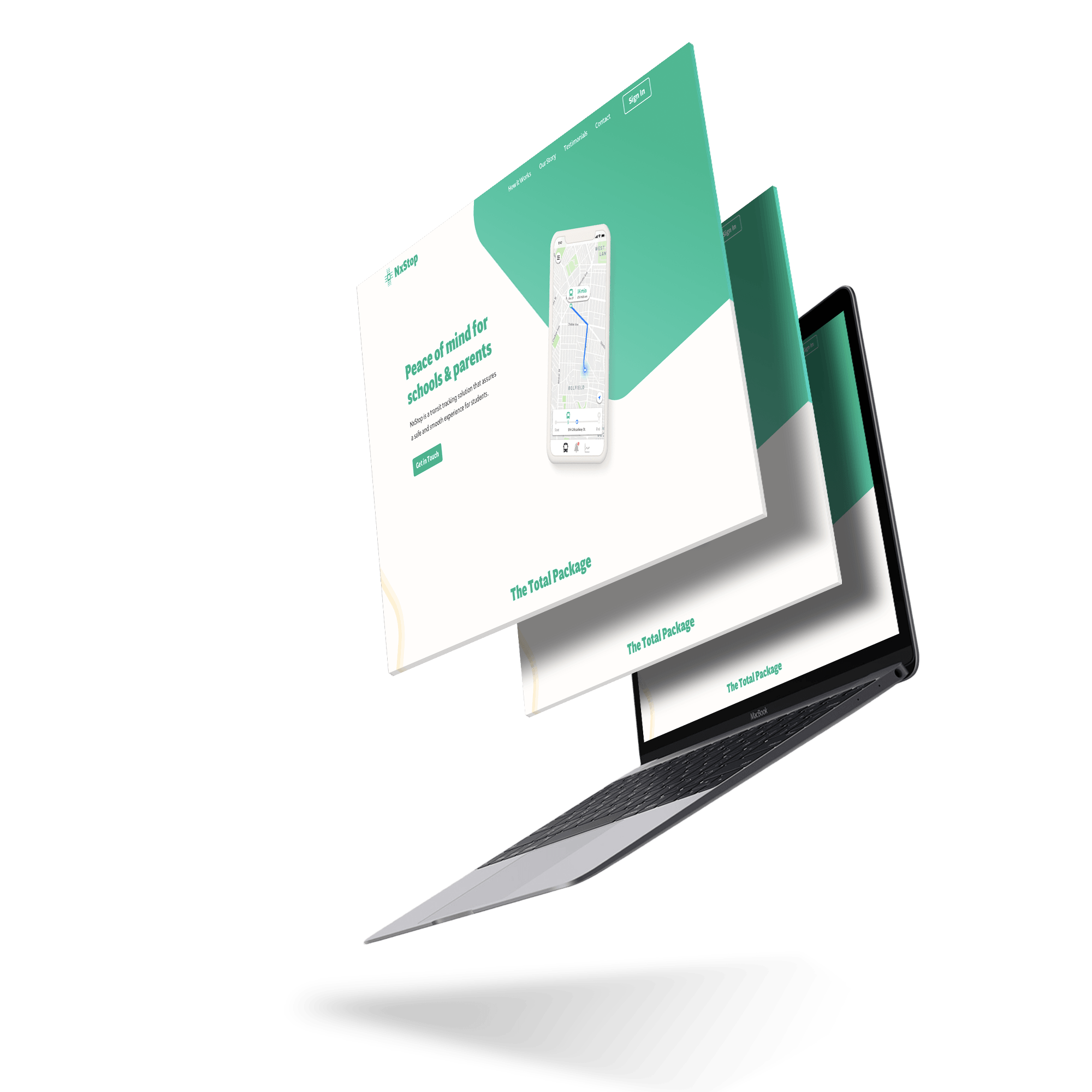
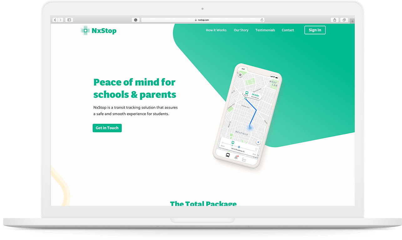
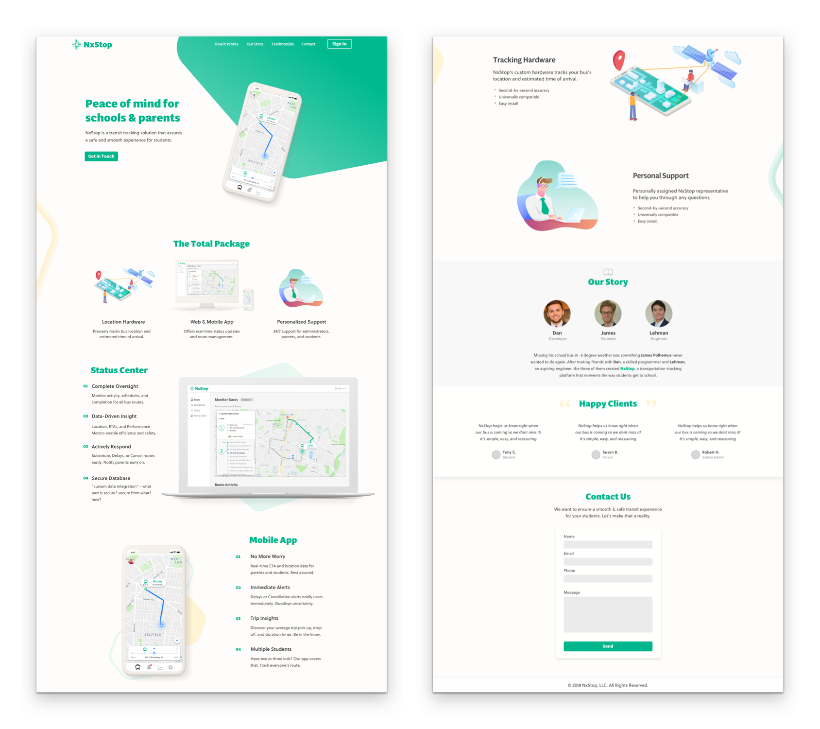
Landing page
Design - I designed a new landing page that showcases key differentiators and value propositions into a modern brand style.
Development - I developed the frontend HTML, JS, and CSS for desktop and mobile responsiveness.
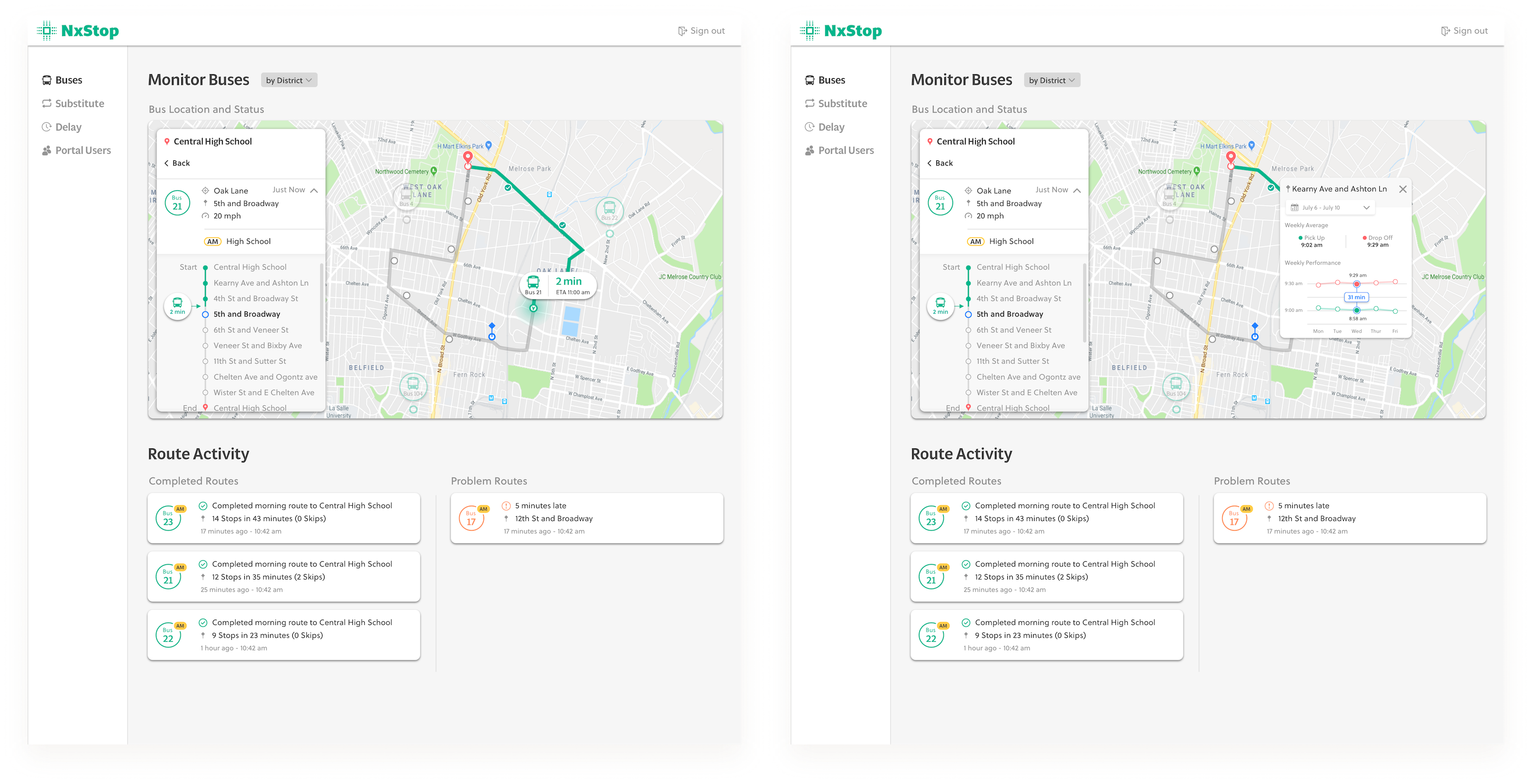
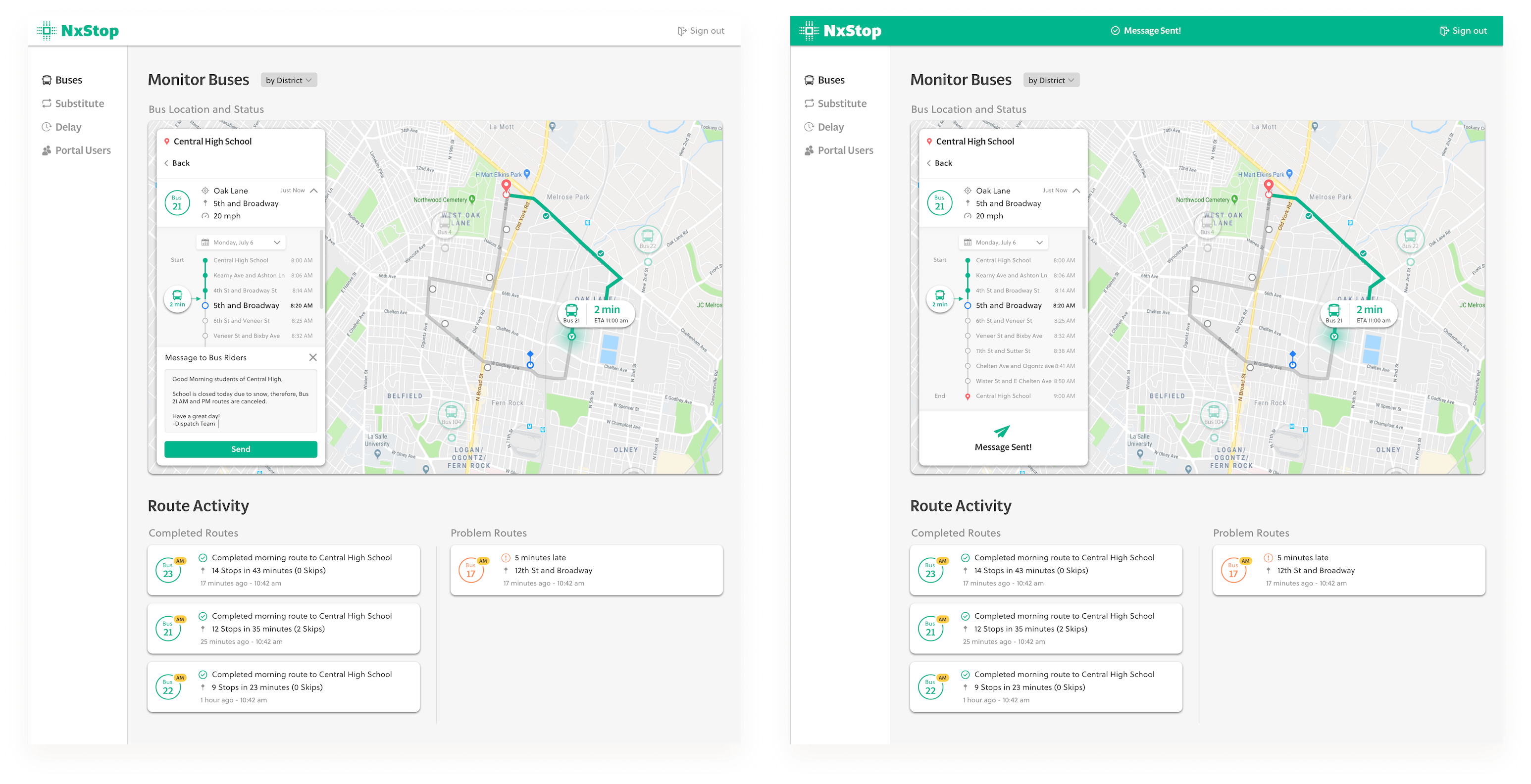
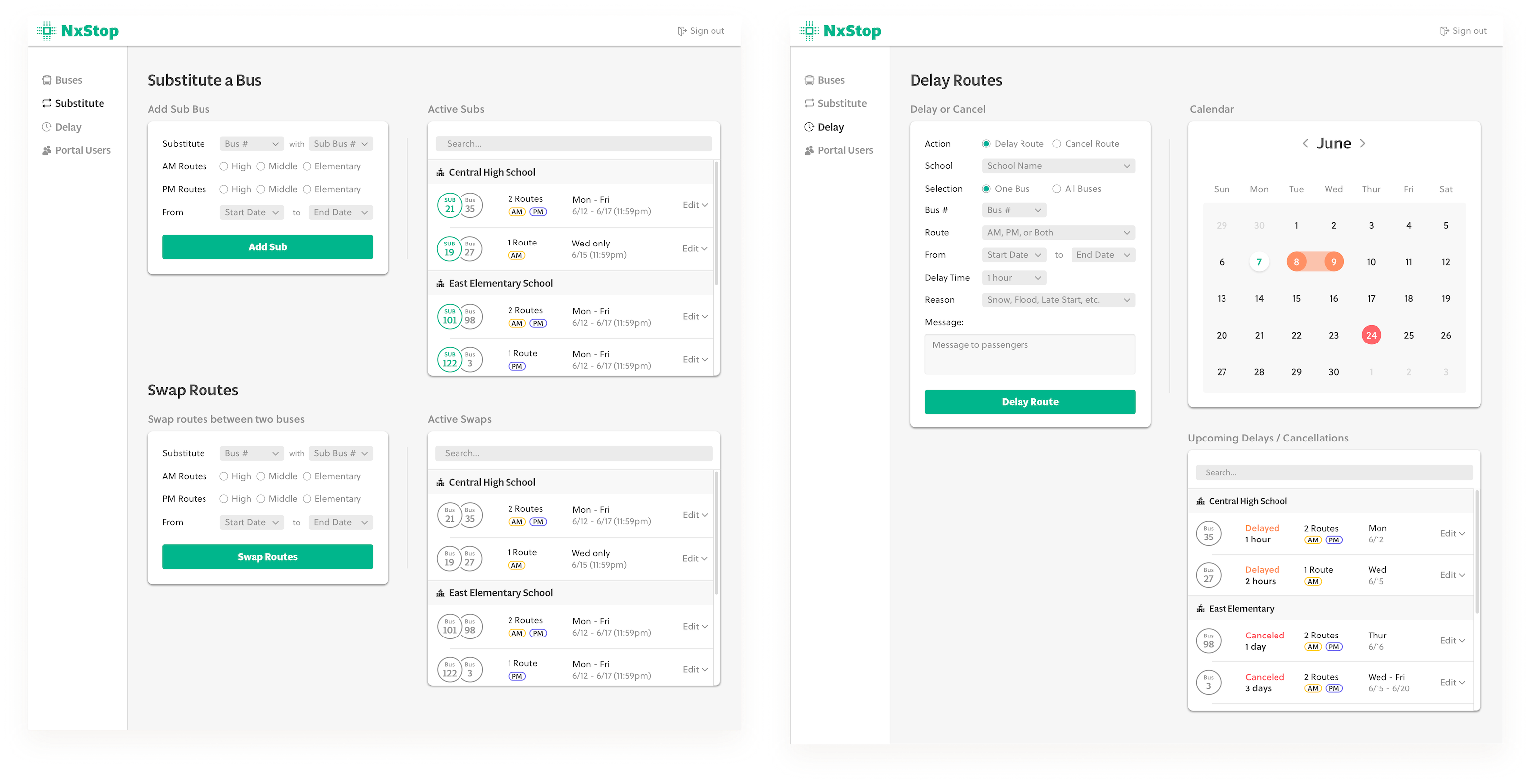
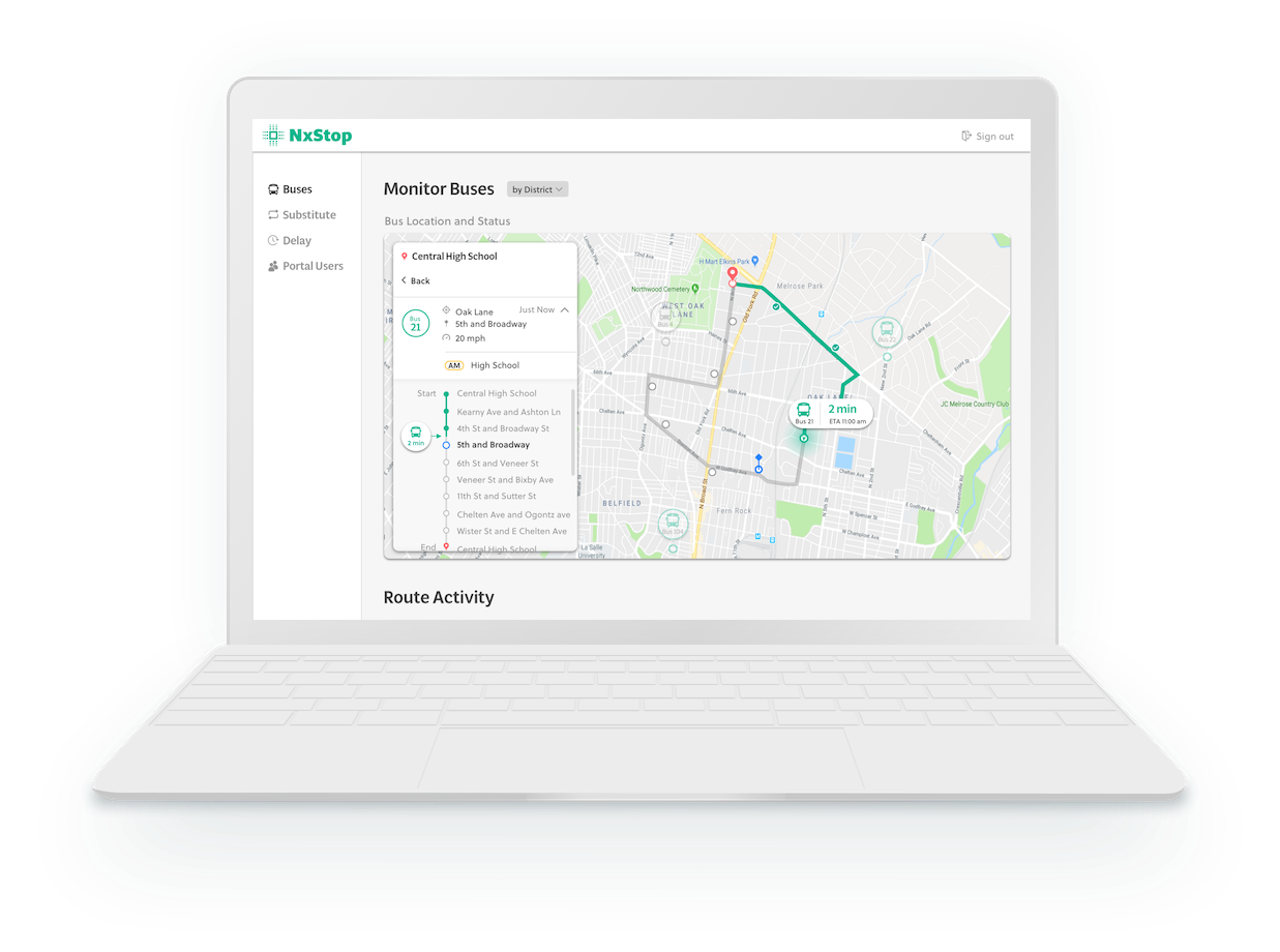
Admin portal
I redesigned the UI to include route progression, performance metrics, and destination timelines in order to give the user more situational context. I applied a modern, energizing, and minimal visual style to appeal to the family as a whole.
Results
Successes
- Create a simple and sleek mobile interface that emphasizes data visualization to provide more insight to the students.
Introduced new features that target the user’s concerns of ETAs, trends, and expectations.
- Simplified desktop architecture and provided simpler navigation for administrators to manage routes.
Lessons learned
- Data should be communicated in a clear and relevant way in order to empower users' decisions ahead of time.
- Meaning is cultivated by connecting the dots between what data is available and what data users are interested in.
- Important questions to ask when designing for improvement are "Does this benefit anyone?” and "Is this the benefit the user is looking for?"
Sam's ClubConsumer, Enterprise, Design Systems
TwitterEnterprise, Design Systems
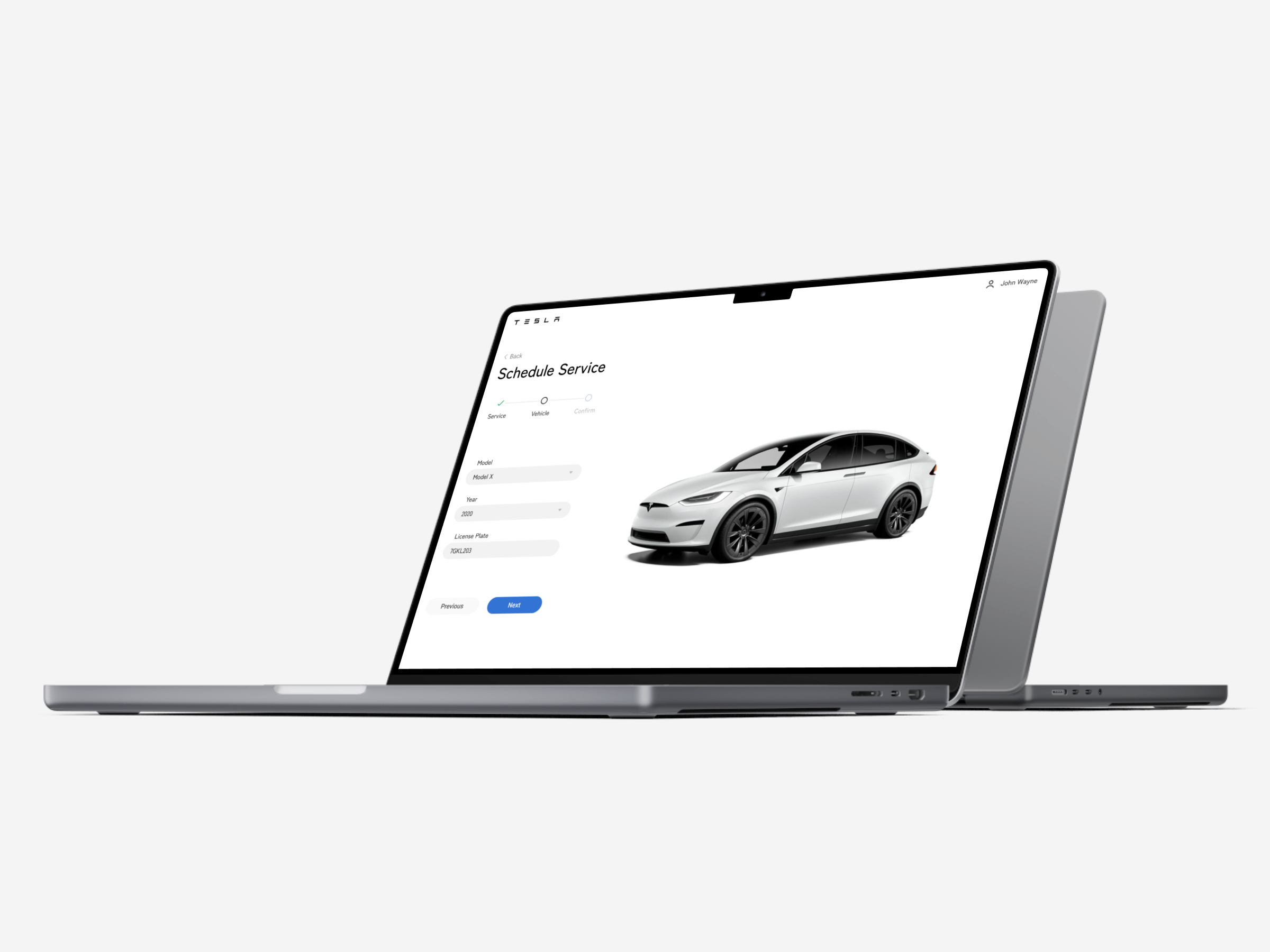
TeslaEnterprise, Design Systems
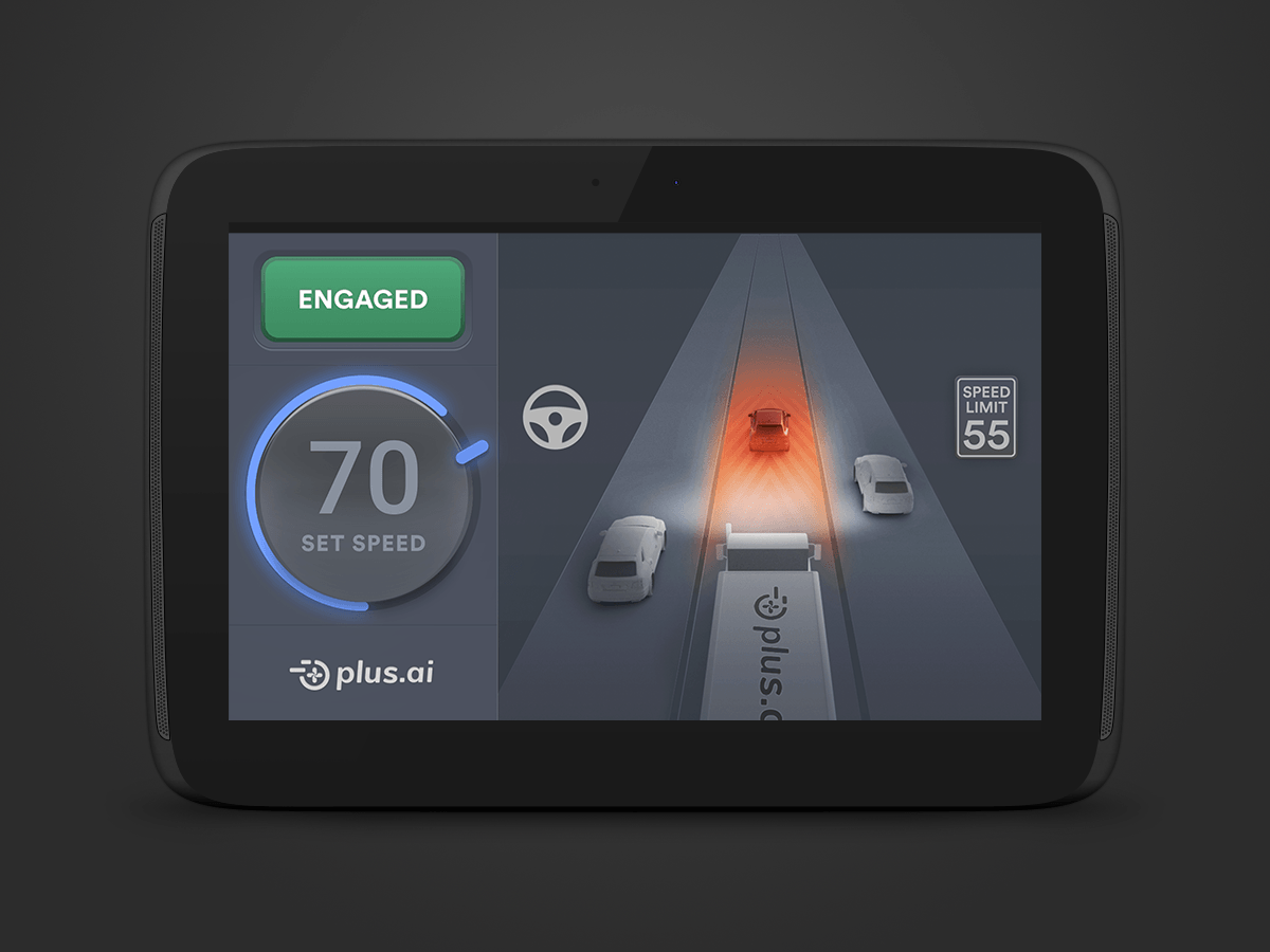
Plus.aiStartup
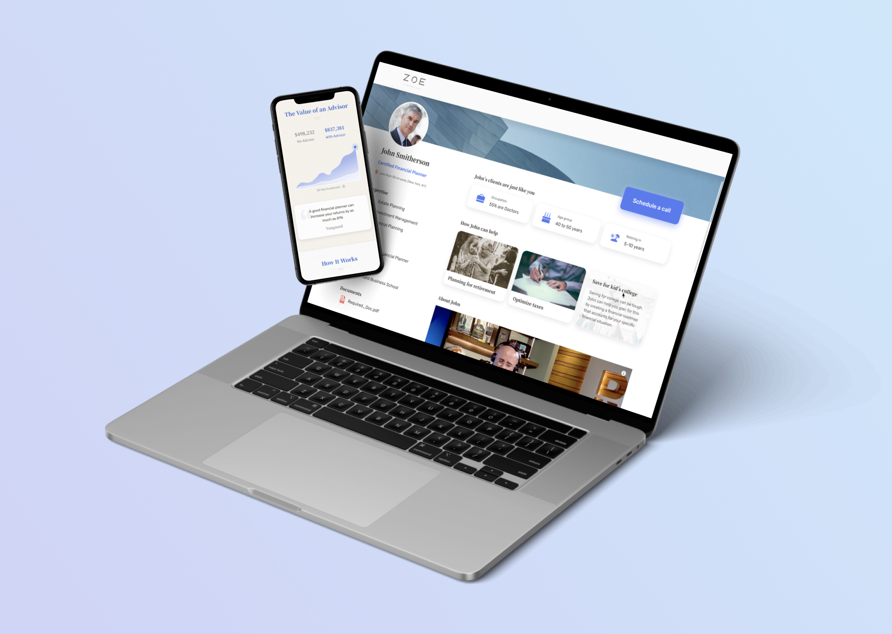
Zoe FinancialConsumer, Associate

PhotographyPersonal